The Greens had a particularly good showing in the 2010 Federal election, winning their first lower house seat in a general election, receiving their highest ever share of the primary vote, and increasing their Senate representation to nine. Concerns have been raised in the Victorian state branch of the ALP, however, that these gains came at the expense of the ALP. So, how seriously should the ALP be concerned about the Greens?
To examine this issue, I created state-specific scatter plots tracking electorate-level results from the last four Federal elections. In each plot, the vertical axis represents the percentage of primary votes cast in favour of the Greens while the horizontal axis represents the ALP two candidate preferred vote.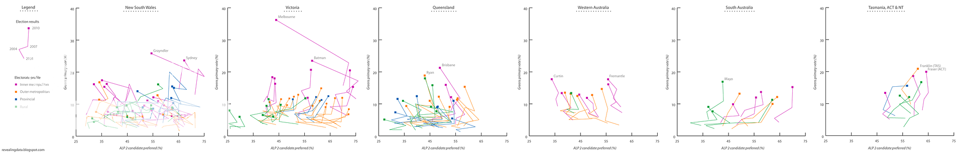
As the plots indicate, the Greens primary vote has been rising since the 2001 election. These increases have occurred irrespective of whether the ALP two candidate preferred vote has trended towards the ALP (Victoria, South Australia, Tasmania, ACT, NT), away from the ALP (Western Australia), or moved in every-which direction (New South Wales, Queensland). As such, there does not appear to be a consistent relationship between the Greens primary vote and the ALP two candidate preferred vote.
So, should the ALP be worried? Yes and no. In most electorates, the Greens are unlikely to threaten ALP candidates, at least in the foreseeable future. The exceptions are in inner-city electorates held by ALP MPs. In 2010, for instance, the Greens primary vote exceeded that of the Liberal Party in three electorates (Grayndler, Melbourne, and Batman), forcing a run-off between the Greens and the ALP. One of these electorates (Melbourne) ended up going to the Greens, and future gains in the Greens primary vote could also see the seats of Grayndler and Batman come into contention.
Notes:
- An explanation of the two candidate preferred vote can be found at the AEC website.
- Four electorates (Kennedy, Lyne, New England, and O’Connor) were not included in the plots because the ALP was not represented in the Two Candidate Preferred Vote.
Roast lamb and roast beef are classic Australian dinners, and both are, in their own right, quite delicious. In recent years, however, there have been a growing number of articles in the popular press examining the environmental impact of eating meat. Which got me thinking: is it more environmentally friendly to eat lamb or beef? And how do these meats stack up against the other ingredients that are commonly used in a roast?
The data presented in the graph below relates to the amount of water (in cubic metres) and CO2-equivalent emissions (in tonnes) required to produce one tonne of the selected ingredients in Australia. Lamb appears to be more environmentally friendly than beef, at least when evaluated in terms of water and carbon emissions. Nevertheless, both meats have a substantially greater impact on the environment than vegetables. So, next time you are making a roast, think about using lamb instead of beef and consider reducing the amount of meat that you use.
Notes:
- Yes, pumpkin and onions are essential elements of a roast, but I couldn’t find Australian water consumption figures for these vegetables.
- The Peters et al. (2010) paper provides several estimates of the CO2-e emissions associated with both beef and lamb production. The means of these estimates were used in the graph above.
- The CO2-e figures relate only to the production of the raw ingredient. Thus, the energy required to transport and prepare these ingredients is not considered.
- Maraseni et al. (2010) – An assessment of the greenhouse gas emissions from the Australian vegetables industry: Table 4
- Peters et al. (2010) – Red meat production in Australia: Life cycle assessment and comparison with overseas studies: Table 3
- Water footprint network – Water footprints of crop and livestock products (m3/ton) for some selected countries (1997-2001)
On the 31st of August, 1854, an outbreak of cholera struck the Soho district of London. At the time of the outbreak, the prevailing theory was that cholera and other infectious diseases were spread by ‘bad air’. Dr. John Snow, a local physician, was sceptical of this theory and, with the help of a local minister, found sufficient evidence that cholera was a water-borne disease to convince local officials to disable the water pump at the heart of the outbreak.
In subsequent years, Snow went on to map the residence of each person who was infected with cholera in the 1854 Soho outbreak. The key insight from his map was that disease – and more generally health – has a spatial dimension. In the case of Snow’s map, this spatial information provided some clue as to the cause of the health condition. In many contexts, however, simply seeing geographical variations in health-related indicators can be of interest, especially to public policy makers.
Each of the maps below represents the local statistical areas that correspond to the suburbs of Melbourne, Australia. As can be seen from the maps, certain health-related indicators vary dramatically across suburbs. Notice in particular the greater rates of physical inactivity and psychological distress in the inner western and outer south-eastern suburbs. Also note that smoking rates appear to increase with distance from the Melbourne CBD.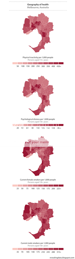
Source:
- Social Health Atlas of Australia, 2010 – Statistical local area data
Asylum seekers are back in the news following recent comments by Julia Gillard and Tony Abbott. Unfortunately, neither politician appears to be doing much to contextualise the numbers that lie at the heart of this issue.
As the graph below shows, there was a spike in the number of so-called ‘unauthorised boat arrivals’ during the 2008-2009 financial year. Nevertheless, more unauthorised entries were detected at Australia’s airports than in Australia’s waters. And from an international perspective, the number of unauthorised boat arrivals entering Australia is miniscule.
For the interested reader, Robert Carr has also created an infographic on this issue.
Notes:
- The USA figures cited above were for the US Government’s financial year, which begins October 1 and ends September 30.
- There was a discrepancy of 7 people between the figures supplied by DIAC to the Senate and the figures that appeared in their 2008-09 annual report. The smaller figure of 985 was used to formulate this infographic.
- Department of Immigration and Citizenship – Question taken on notice
- Department of Immigration and Citizenship – Annual report 2008-09: Table 1
- White House - Blog
- UK Home Office - Research development statistics
- United Nations High Commissioner for Refugees – 2009 Global trends: Table 2