The Tour de France has just entered the second week of racing, and I’m tired. In a good way. Because if you’re an Australian fan of the Tour de France and you like to watch each stage live, you must be prepared to lose a little shut eye.
While I love the TV coverage of the race, it can sometimes be difficult to gauge how cyclists who are not race favourites fare on each particular stage. To this end, I created a graph using data from the 2009 Tour de France to determine the stages that had a major effect on cyclists’ times.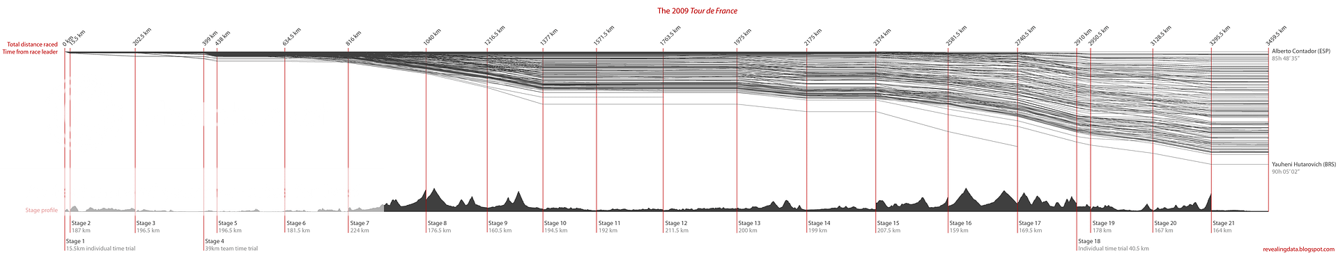
Source:
- Amaury Sport Organisation – Tour de France website
Subscribe to:
Post Comments (Atom)
No comments:
Post a Comment